Supreme Award Winner 2015
The Tooth Company sought to redefine the dentistry experience as a whole. We began with a stark concrete shell, of typical aluminium joinery, and a dark grey concrete structure set within a harshly lit lobby area. We configured our organic fit out as though it was pushed and pulled by the building itself, fluidly absorbing daunting concrete beams above, and the unsightly services we inherited.
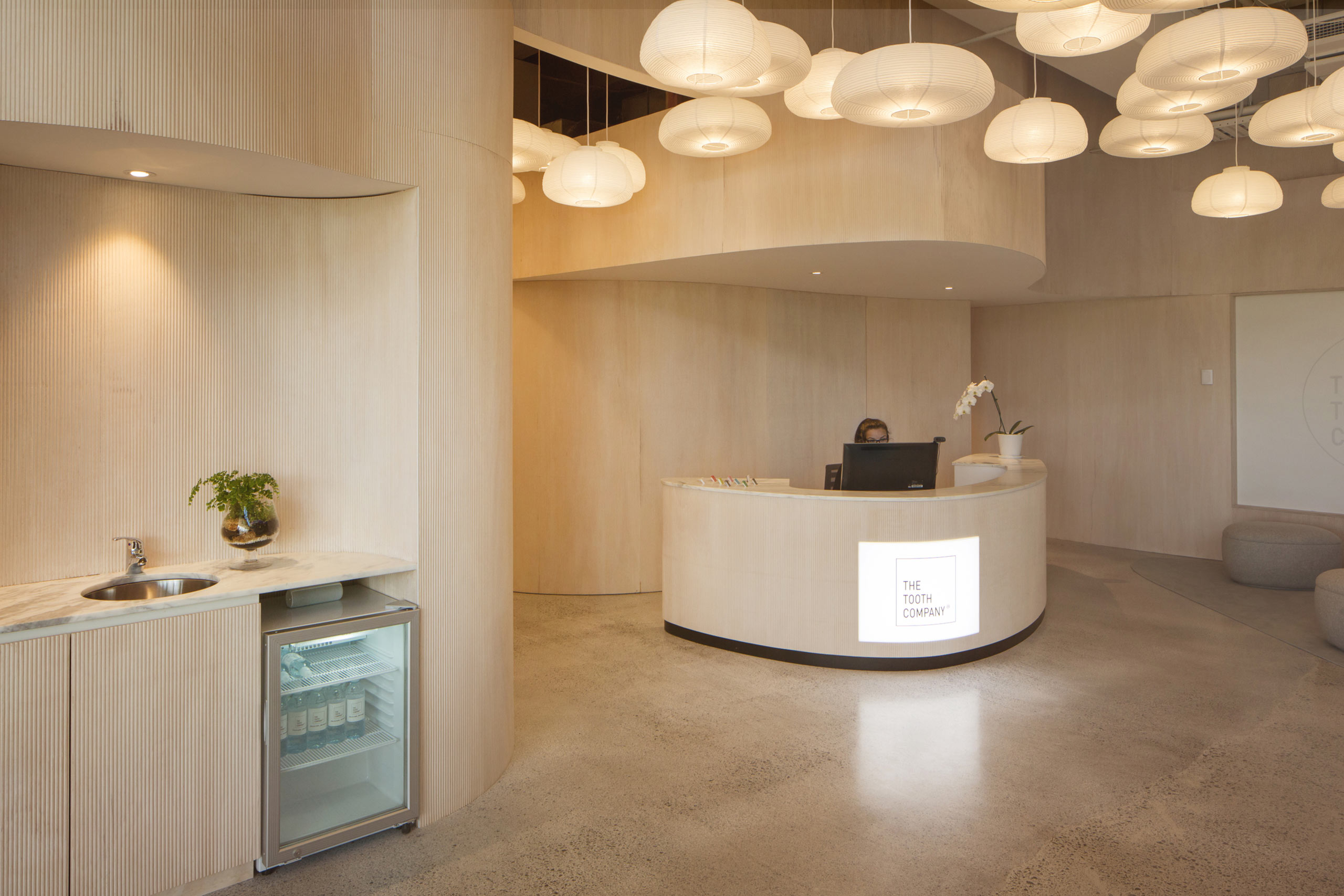
White washed timber walls with soft sweeping curves are inserted into a modified shell of tinted concrete floors and warm white painted infrastructure above. We wanted the space to feel like a Scandinavian spa, full of warmth, texture and soft tones. We wanted to create a space that both adults and kids could feel comfortable in.
We formed subtly fluted timber walls; each routed, machined and individually sanded from sheets of ply, a method we hoped would abide to our very thin budget. We used bendy ply to create the gestural curved walls that peel themselves from the raw concrete columns and sill lines; offering an organic ribbon that floats through the confined space. We brought stacks and stacks of paper lanterns to fill the high void, creating warmly lit clouds of light that glow all day long. We crafted slender timber lined rooms for meetings, patients and staff members.
A hand-painted number sits above a singular brass handle at the doorway into each surgery. Beyond lies a room full of dappled sunlight, a soft grey leather chair and a bespoke brass rimmed light above. Everything has a place, a purpose, an essential part to the function, but seeks elegance in its nature and materiality.
Our intention was to create a whole experience like no other, a bespoke space crafted from a generic shell, that it might remain softly enfolding people for years to come.


